


Still, looking for the best WordPress data visualization plugin? Let me share with you my findings after reviewing over 25 data visualization plugins. I hope by the end of this post, you will find the best data visualization plugin for your WordPress website.
Before we dive in, you need to understand you can use data visualization for a clear understanding of certain changes, and besides, you can also use it for helping users on your site comprehend the story you try to tell in your posts quicker.
Showing charts and infographics in your posts can largely enhance engagement on your website. Besides, readers can comprehend colorful charts, graphs, and infographics faster than boring raw data.
Data visualization helps you achieve this, and there are many good data display WordPress plugins around to choose from. This simple post will walk you through the top-rated WordPress data visualization plugins of 2021.
What Is Data Visualization in WordPress?
If you are wondering what data visualization is, it is converting numerical data into a graphical form which can be interactive graphs, tables, and infographics. When you visually represent your data, it helps the audience quickly understand what the data is trying to tell.
One good example would be Google Analytics, and the tool represents data in visual forms as well. You can easily know if your site had a decline in traffic or a rise in traffic by simply looking at the line graph.
Now, what is important to understand here is that data visualization can save your audience a lot of time, making data a lot simpler to comprehend. Hence, using data visualization, you can enhance your blog posts and you can do it by using one of the best WordPress data visualization tools.
Some of these data visualization plugins can generate dynamic tables and charts with users’ inputs. Using data visualization, you can build a good audience base as this will improve the user interaction, and that way, you can engage your website audience.
Types of Data Visualization in WordPress
Data visualization is a brilliant way of sharing useful data with your audience. However, there is a thin line between using just data and using the right data. You will understand this better as you get well acquainted with the different types of data display in WordPress.
- Charts and graphs
- Table of Comparison
- Infographics
- Events Timeline
- Pictorials
- Map visualizations
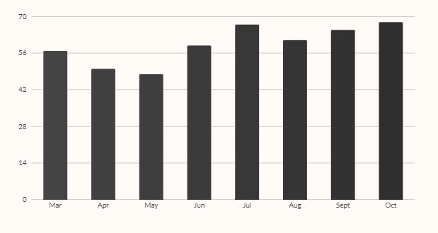
1. Charts and Graphs
If you are just getting started with data visualization, the best way to go about it would be to start with the basic charts and graphs such as a pie chart or a bar chart. Even these basic data visualization patterns can create a tremendous difference in conveying a story in a precise, organized, and simple way to the audience.
Basic charts and graphs with their usage:
- Line graphs: Ideal for displaying the changes over a certain time for single or multiple groups
- Pie charts: Ideal for comparing parts but don’t reflect changes over time
- Bar graphs: Ideal for comparing various groups, reflecting the major changes over time
- Area graphs: Another brilliant way of tracking changes of a single group or multiple groups over time
Data visualization plugins that can create charts and graphs: Monster Insights, WP Forms, Canva Graph Maker, and Easy Charts.
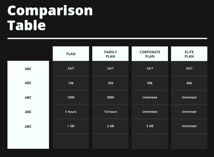
2. Table of Comparison
Using a table of comparison is an excellent way of using data visualization, especially when you want to highlight the important differences between two or more entities.
Using such an approach, you can present a comparison and explain the important differences in fewer words. Using comparison tables, you can help your audience easily understand a comparison in no time.
Plugins you can use to create amazing tables of comparison: Data Tables Generator, Inline Google Spreadsheet Viewer, Visualizer, and TablePress.
3. Infographics
Infographics is an innovative way and visually appealing way of representing data, which not only makes it easy for the audience to understand what you are trying to tell using the data but also makes your post pretty engaging. Besides, you have infinite ways of representing your data as long as you choose to use infographics.

Creating an infographic takes the right mix of innovation and creativity. Further, you may create or alter an existing infographic depending on your understanding of your audience.
Two good plugins you can use for creating infographics: iList Infographic Maker, and Canva Graph Maker.
4. Event Timeline
An event timeline uses a line or area chart in combination with various events. That way, you will see the changes that occurred over a certain time alongside the events that have caused the changes.
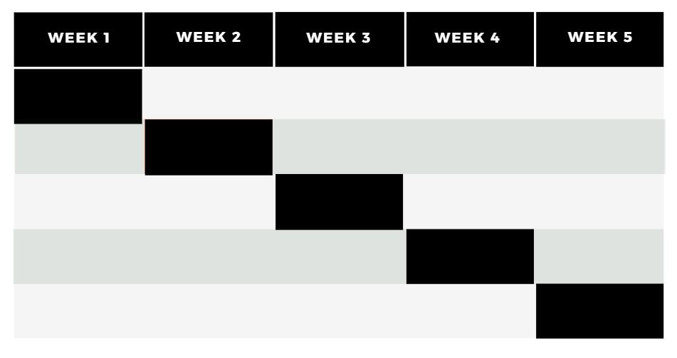
Hence, when you feel there is a need to tell your audience about the changes and related events, an event timeline is the best option to go with.
Canva Graph Maker allows you to turn your data into a brilliant event timeline.
5. Pictorials
Pictorial is a combination of graphics and chart data. You can convey a story using a simple chart, but adding an image to it can have a great impact on your audience and would convince them to engage and interact more with your post.

You can create excellent pictorials using plugins such as Visualizer, WPData Tables, WP Forms, and Canva Graph Maker.
6. Map Visualizations
Map visualization can be a pretty powerful way to communicate data relating to a certain location or locations. For example, you can display the density of a place or show the GDP trends across the world.
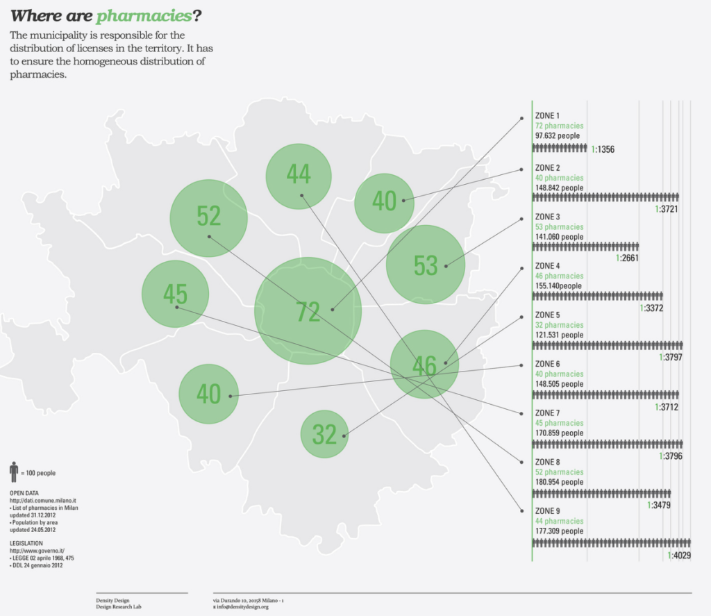
Bubble map and Choropleth map are two popular maps. While Bubble displays the total value, Choropleth uses color shading and assigns value to every color code.
Some of the data display WordPress plugins you can use for map visualizations: Snowball, Visualizer, and Canva Graph Maker.
Why Use a Data Display Plugin on Your WordPress Site?
Now that you know what data visualization is all about, it’s time that we look into the ways of how we can implement it on a website. Since most of the websites these days are created using the WordPress CMS, you can use a data visualization WordPress plugin to achieve the data visualization that you want on your posts.
However, there are different types of data visualization, and you must choose a WordPress data visualization plugin that would entirely suffice your requirement.
Benefits of Using a WordPress Plugin for Data Visualization
- Simplifies complex data and generates content that is by far more comprehensible than cluttered spreadsheets
- You only need to provide the tool with the data and the visualization would be auto-generated
- Takes comparatively much lesser time than creating a data visualization manually using tools such as Canva
- Most of these data visualization plugins can be integrated with other popular tools such as Google Analytics, Mailchimp, etc.
- Some of these tools also allow you to customize the report appearance with handy features like front end editing
11 Best Data Visualization Plugins for WordPress
Without any further ado let us look at the best WP data visualization plugins.
1. MonsterInsights

Monster Insights is an excellent WordPress analytics plugin with over 2,000,000 installs. The WordPress plugin offers an exceptionally user-friendly interface and you can quickly get the hang of this tool.
Just to quickly help you understand what the tool does, Monster Insights is a data visualization tool that helps you visualize the data collected from various integrated sources, in the form of graphs and charts. The tool seamlessly integrates with various other plugins and tools such as WooCommerce, Yoast, Google Analytics, Google AdSense, Pretty links, and more.
Setting up Monsters Insights is even easier than setting up Google Analytics. You don’t need to add a single line of code anywhere. All you have to do is install the plugin and activate the features of your choice. Besides, the tool helps you effortlessly set up Google Analytics in WordPress and view the data in the form of various forms, graphs, and charts.
Features:
- Helps you track your audience across different devices and campaigns in a few clicks
- Lets you view your Google Analytics dashboard right from our WordPress dashboard
- A/B testing feature allows you to compare two versions of your landing pages, and understand what is working and what is not, which helps you optimize our content
Best for:
The plugin is best for bloggers, store owners, business websites, and agencies. The tool helps you in studying the behavior of your audience on your WordPress site and this eventually helps you develop better content, keeping the audience interests in mind.
2. WP Forms
With over 4,000,000 users, WP Forms is a pretty popular data visualization plugin with a prime focus on surveys. The tool allows you to view the data collected from the survey and polls in the form of graphs and charts.
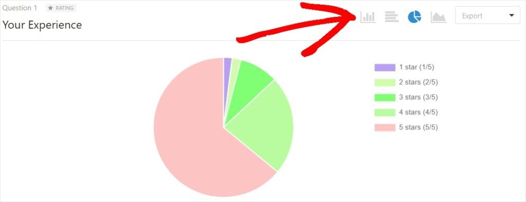
You can easily turn your survey results into a nice Pie Chart. To do this, you could get to the WP Forms settings and click on All Forms.
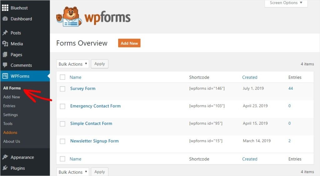
Next, you could hover over the survey form for which you want to generate the Pie Chart and click on Survey results.
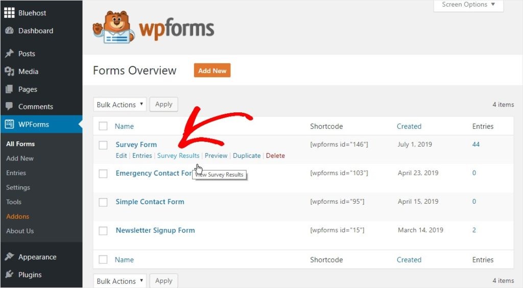
This should show you the Pie chart icon on the upper right side. Clicking on it, you can visualize the result in the form of a Pie Chart.
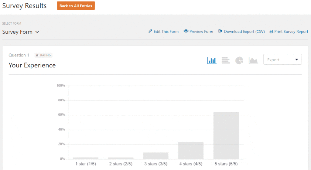
To visualize your survey results in any other forms such as line charts and vertical or horizontal bar graphs, you could click on the icons next to the pie chart icons. This is how simple it is and this certainly makes it a lot easier to comprehend data.
Besides the tool allows you to export your charts and graphs in JPG and PDF. Further, it also helps you embed your charts and graphs into presentation software or an infographic.
Features:
- Helps collect accurate data with smart conditional logic
- Allows you to visualize data using various graphs and charts
- Allows you to export and embed your graphs and charts
Best for:
The plugin is great for marketers and store owners to gather data of website visitors by running surveys. Once you have the data, you could comprehend it easily using different graphs and charts.
3. Canva Graph Maker
Canva Graph Maker is a user-friendly and simple tool to convert raw data into visually appealing graphs and charts in no time. The tool offers you a wide range of data virtualization options to illustrate comparisons, trends, proportions, relationships, project management, and more. Further, charts created using this tool are pretty easy to understand.
The tool allows you to choose from many charts and graphs and some of them are area charts, bar graphs, comparison charts, donut charts, pie charts, t-charts, bubble maps, concept maps, decision trees, family trees, Gantt chart, and more. Besides, the tool offers you a lot of professional templates to select from.
Here is what you have to do to create a data visualization using this tool:
- Choose a template
- Add your data to it
- Customize it by adding icons, illustrations and changing the fonts and backgrounds
- Once it’s ready, you can download, print, or share it
Features:
- Designing is ridiculously easy and quick with drag and drop editing and professionally designed templates
- Create amazing data visualization by simply adding data to a template
- Allows you to embed your graph in presentation and reports
- Provides you with a lot of graphs and charts to select from
- All templates are highly customizable
Best for:
The tool is certainly for non-designers but anyone with an online presence can benefit a lot from using this tool. The tool is great for bloggers, marketers, and online business owners.
4. Snowball

Snowball is a powerful WordPress plugin for content creation and can also help you create amazing data visualizations alongside images, videos, and interactive widgets. As far as data visualization goes, the tool supports the Bar Graph, Scatterplot, and Choropleth.
Setting up the plugin is just about a couple of clicks. The plugin offers a user-friendly editor and uses content blocks. The webmaster has all the content options at the top including the data visualization options. The best part is you don’t need any knowledge of coding to use this excellent plugin.
Using Snowball, you can create engaging data visualizations for your audience. With the use of Snowball’s Bar Graph, Scatterplot, and Choropleth, you can convey various data quickly to your audience and at the same time, encourage them to interact more with your content. The tool is best for long-form articles. However, you can use it any way you like.
Features:
- Supports Bar Graph, Scatterplot, and Choropleth
- Supports images, videos, and interactive widgets
- User-friendly interface with content blocks
Best for:
The plugin is best for journalists, bloggers, and marketers. Using this plugin, you can illustrate and explain various data-related things in a very simple and organized manner to your audience.
5. Easy Charts

Easy Charts by Kiran Potphode is a pretty simple and powerful WordPress plugin for data visualization. The plugin allows you to generate charts from the existing data and display them on your website. Besides, the charts created using SVG and CSS3 are pretty interactive.
Easy Charts supports as many as 12 chart types:
- Bar Chart
- Stacked Bar Chart
- Step Up Bar Chart
- Percent Bar Chart
- Area Chart
- Stacked Area Chart
- Percent Area Chart
- Line Chart
- Pie Chart
- Donut Chart
- Polar Area Chart
- Waterfall Chart
You can embed the charts anywhere in your posts and pages. Besides, you can use multiple charts or even use a single chart multiple times on a page.
Features:
- Allows you to use the same data for any type of chart
- Simple to manage and customize
- Allows you to download charts as images
- Allows you to embed your charts anywhere
- Comes with elegant designs
Best for:
Easy Charts is best for marketers and bloggers for elaborating on many complex things comparisons based on actual data. Of course, businesses can also make the most out of this amazing tool to show their journey so far or show how well a product is doing over the years.
6. Table Press
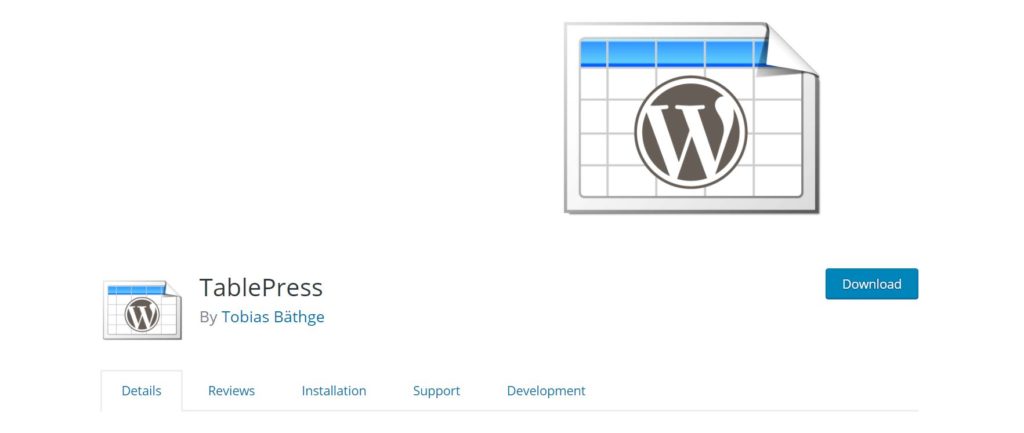
TablePress is an open-source WordPress plugin to create and manage data tables on your website. You can edit the table data in an interface somewhat as in a spreadsheet and there is no coding knowledge required. You can have data including formulas in your table data using TablePress. TablePress allows you to embed your tables into posts and pages using shortcodes.
Besides, the tool comes with an additional JavaScript library for features such as sorting, filtering, and pagination. Further, you can import tables from Excel, CSV, HTML, and JSON files. You can have extended functionalities by installing the TablePress Extensions.
Features:
- Comes with a Spreadsheet-like interface
- Import tables from Excel, CSV, HTML, and JSON files
- Functionalities such as sorting, filtering, and pagination
- Extended functionalities with TablePress Extensions
- Supports shortcodes
Best for:
TablePress is best for bloggers and marketers for displaying various comparisons. For example uptime and speed comparisons of two web hosting services.
7. WP Data Tables
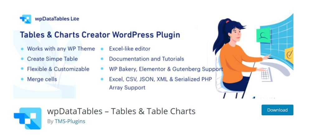
WPData Tables is an advanced WordPress data table plugin that helps you create visually attractive tables and table charts from various data sources such as Excel, CSV, and PHP. Using this plugin, you can easily convert complicated data into concise and user-friendly data visualization forms such as tables and charts.
Recently, WPData Tables has incorporated a lot of new features to offer more freedom of creating and managing data tables on WordPress. Now, you can merge cells in an Excel-like editor. Besides, you can easily add or remove, resize or reorder columns and rows. Further, now WPData Tables provides you with the option of cell custom formatting, adding star rating, and using shortcodes in cells.
It’s time that we look at the WPDataTables charts and the plugin allows you to select from as many as 14 chart types, making use of the Google Charts rendering engine.
Here are the chart types:
- Line Chart – Live example
- Column Chart – Live example
- Pie Chart – Live example
- Area Chart – Live example
- Stepped area Chart – Live example
- Histogram – Live example
- Bar Chart – Live example
- Stacked Bar Chart – Live example
- Bubble Chart – Live example
- Donut Chart – Live example
- Gauge Chart – Live example
- Scatter Chart – Live example
- Candlestick Chart – Live example
- Waterfall Chart – Live example
Creating a data table with this plugin is just about 3 simple steps:
- You can upload table data from Excel, CSV, JSON, XML, or Serialized PHP array or you can create one using the new table builder.
- Next, you could customize and configure the table columns including the color and font adjustments.
- Once your table is ready, you can insert it into your post or page
Features:
- Comes with an Excel-like editor
- Allows you to create data tables and charts from Excel, CSV, and PHP
- Supports 14 chart types
- Allows you to add or remove, resize or reorder columns and rows
- Supports cell custom formatting
Best for:
The plugin is ideal for marketers, bloggers, and analysts to tell various data-based stories or display various comparisons to their audience in a concise way.
8. Visualizer
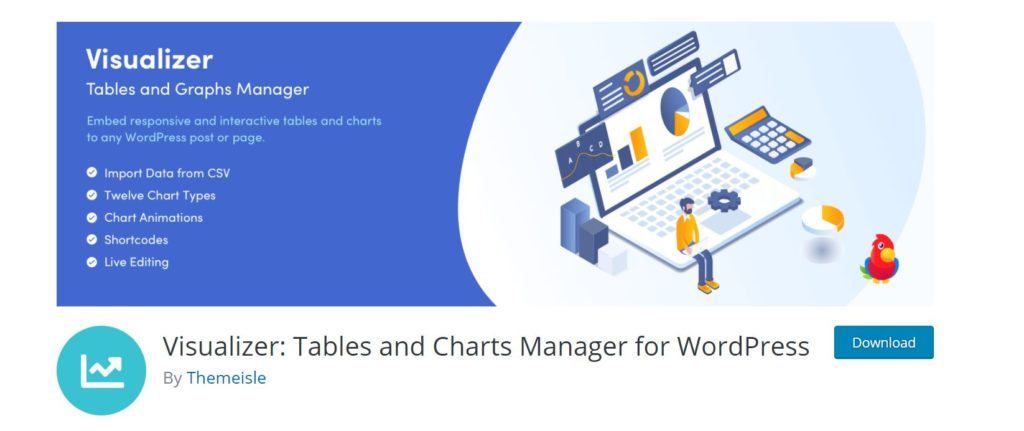
If you are looking for an easy yet powerful WordPress data visualization plugin, the Visualizer by Themeisle is the one for you. The plugin allows you to create and manage responsive & animated charts, graphs, and tables, making use of the Google Visualization API, DataTables.net, and ChartJS.
You can also embed these charts and tables easily in your WordPress posts and pages. All the charts and tables are completely customizable. Further, the plugin allows you to import data from Google Sheets, Excel, and CSV.
The plugin provides you with as many as 9 chart types plus 6 more in the Pro version. Just to name a few chart types it offers, the plugin has line charts, area charts, bar charts, column charts, pie charts, geo charts, table charts, and bubble charts. Inserting one of these charts into your posts and pages is pretty simple.
Features:
- Allows you to create responsive & animated charts, graphs, and tables
- Allows you to import data from Google Sheets, Excel, and CSV
- Offers 9 chart types plus 6 more in the Pro version
- All charts and graphs are highly customizable
Best for:
The plugin is suitable for beginners in data visualization and is equally good for experts. To be more specific, it’s an ideal tool for bloggers, news sites, and marketers.
9. Inline Google Spreadsheet Viewer

The Inline Google Spreadsheet Viewer plugin helps you convert data from Google Spreadsheet, CSV, MySQL, and even Google Apps Script into interactive charts, graphs, or sortable tables. The plugin comes with a built-in cache that offers extra speed.
Besides, the plugin gives you full control of the chart’s look with various configuration options and you can customize it any way you like. It is also ridiculously simple to embed the charts and graphs into our posts and pages.
Features:
- Helps you create interactive charts, graphs, or sortable tables
- Allows you to export data from Google Spreadsheet, CSV, MySQL, and even Google Apps Script
- Charts and graphs are highly customizable with various configuration options
- Comes with a built-in cache to offer extra speed for the charts and graphs to load faster
Best for:
The plugin is good for anyone who is looking for a free data visualization plugin with all the premium features. The Inline Google Spreadsheet Viewer plugin is a good tool for marketers, bloggers, and news sites owners to illustrate various data-related comparisons in a visually comprehensible way.
10. Data Tables Generator
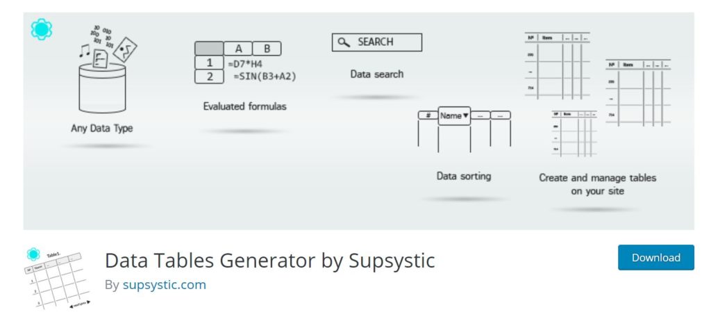
Are you looking for a plugin to create SEO friendly data tables? Data Tables Generator is the plugin that can help you with that. Data Tables Generator allows you to create responsive and sortable data tables with filtering and pagination.
The plugin helps you structure your data in various visual ways such as Diagrams, Charts, and Graphs. Further, the charts and data are pretty easy to manage using this amazing tool. The plugin also allows you to pull data from Excel, CSV, PDF, and Google Sheets. However, to have all these features, you must get the Pro version.
Features:
- Responsive data visualizations such as diagrams, charts, and graphs
- Import data from Excel, CSV, PDF, and Google Sheets
- Advanced functionalities such as filters, search, sorting, and pagination
- Supports frontend table editing
- Supports formulas
Best for:
The plugin is ideal for serious bloggers and for any webmaster who wants to share important stats and comparisons in the posts.
11. iList Infographic Maker
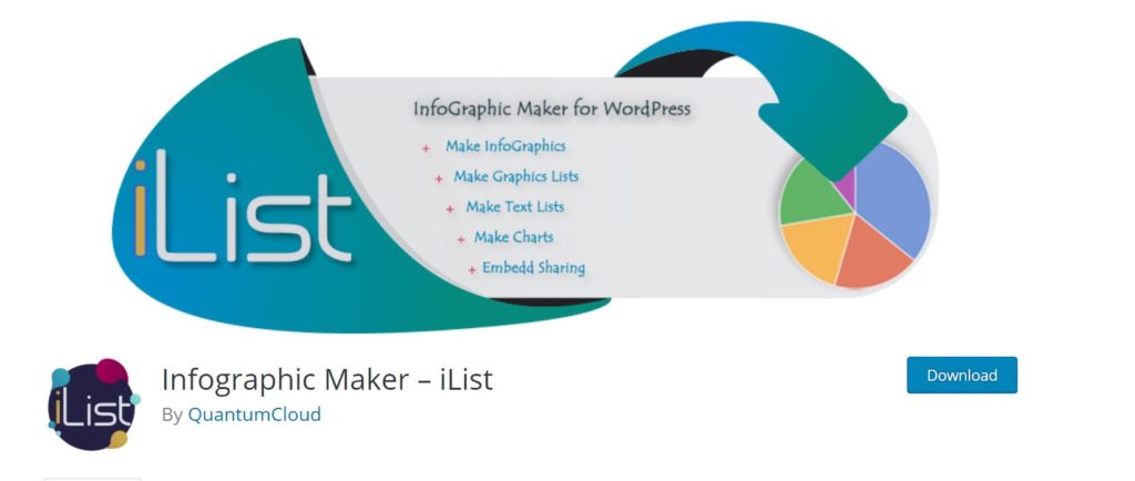
iList Infographic Maker is a brilliant WordPress plugin that helps you make elegant infographics and lists using dynamic and HTML5 charts and graphs. Using such infographics and Listicles, you can certainly have more engaging content on your site and encourage your audience to interact more on your posts.
Most importantly, the plugin allows you to create impressive infographics right from your WordPress backend in merely a few minutes. On top of that, embedding these charts and graphs is easy as you can have them inserted in a post or page by using a shortcode. iList also supports Bar chart, Line Chart, Polar Area Chart, Radar Chart, Pie Chart, and Doughnut Charts. iList uses Google’s chartjs library to generate charts.
Further, you can fully customize the chart and graphs created using iList. Most importantly, the fact that the iList infographics and lists are dynamic and HTML5 based, they are SEO friendly.
Features:
- Allows you to create Infographics, lists, charts, and graphs
- Uses Google’s charts library
- All the charts and graphs are SEO friendly
- Supports shortcodes
- All the charts and graphs are highly customizable
Best for:
The plugin is ideal for bloggers, SEOs, marketers, webmasters, and data visualizers.
Take Your First Step Towards Data Visualization in WordPress Today
Having read the post so far, you should surely know by now how powerful data visualization can be in telling amazing stories and engaging your audience. It should not be difficult for you to understand that turning data into graphics can have more impact on your audience than text content if used wisely.
We tried to keep this post as comprehensive and simple as we could, giving you a clear idea of what data visualization is, its types, and, of course, the various WordPress data visualization plugins that you can choose from.
My Pick: Best Data Visualization WordPress Plugins
If you want a WordPress data visualization plugin for having better access to your site analytics, you can consider choosing Monster Insights. WP Forms is another great option to convert your campaign data to wonderful graphs and charts.
You can also enhance the content on your website by using data wisely and in case you have some data to share with your audience, you can do it using the Snowball WordPress plugin. Using this plugin, you can present your data as Bar Graph, Scatterplot, or Choropleth, making the data pretty comprehensible and your content highly engaging.
Besides you can unleash the power of infographics to accentuate your content further, and to do so, you can use either iList Infographic Maker or Canva Graph Maker. As far as integrating data tables in your content goes, you can choose between WPData Tables, TablePress, and Data Tables Generator.
A Quick Comparison of Top Data Visualization Plugins
| Price | Free Trial | Charts & Graphs | Table | Infographics | Excel import/export | Shortcodes | |
|---|---|---|---|---|---|---|---|
| Monster Insights | $99.50/year | ||||||
| WP Forms | $39.50/year | ||||||
| Canva Graph Maker | $119.40/year | ||||||
| Snowball | - | ||||||
| Easy Charts | - | ||||||
| TablePress | - | ||||||
| WPData Tables | - | ||||||
| Visualizer | $74/year | ||||||
| Inline Google Spreadsheet Viewer | - | ||||||
| Data Tables Generator | $46/year | ||||||
| iList infographic Maker | $24/year |